
A mobiilisõbralik kursus is a mobile-first course: lessons, videos, quizzes and checkout all work reliably on a phone or tablet without pinching, zooming or losing your place. The single most useful thing you can do this week is open your own course on a real Android and iPhone, log in as a student, and click through every lesson yourself. Standards from the Online Learning Consortium's OSCQR rubric, edX's course design guidance, and platforms like Bibliowlteca all point in the same direction: test on real devices first, then fix what breaks.
TL;DR:
- Testing on real Android and iPhone devices in both portrait and landscape modes is essential to identify mobile-specific glitches, especially under throttled connection conditions.
- Build or choose quiz tools that are responsive, enlarge tap zones, and provide accessible alternatives, as drag-and-drop and timed activities often break or become impractical on small screens.
- Simplify course navigation by keeping module and lesson titles concise, limiting taps to reach content, and testing the entire checkout process on a real phone for seamless user experience.
- Regularly run mobile-specific analytics and use student test accounts to monitor drop-off points, buffering events, and usability issues, fixing problems promptly to maintain a mobile-friendly course.
Table of Contents
- A quick mobile readiness checklist you can run today
- How do you optimise video and images for mobile?
- Which quiz and interaction types actually work on a phone?
- How do you reduce navigation friction on a course storefront?
- How do you test and measure mobile course quality over time?
- How Bibliowlteca supports a mobile-first course build
- Ready to publish a mobile-tested lesson?
- Sources
- FAQ
A quick mobile readiness checklist you can run today
Most mobile problems trace back to five things: how you test, how you write, how learners tap, how heavy your media is, and whether you've flagged what won't work on a small screen.
Start with device testing. Create a student-role account (never test as admin, since admin permissions hide the exact glitches learners hit), and click through your course on a real phone in both portrait and landscape. Switch your phone to airplane mode briefly, then reconnect on a throttled connection, to see how your lessons behave when someone's on patchy 4G at a bus stop. The OSCQR review criteria specifically flag multi-device testing, avoiding tables and deep indents, and using percentage-based widths instead of fixed pixel layouts.
Beyond testing, run through this before you publish anything new:
- Break long lessons into short sections with a heading every 200 to 300 words, and keep paragraphs to three or four sentences.
- Make every button and tap target big enough for a thumb, following WCAG guidance that recommends a minimum touch target size sufficient for comfortable thumb interaction.
- Cut navigation to the fewest taps possible between the course home and the actual lesson content.
- Compress images and stream video rather than uploading raw files directly into a lesson page.
- Flag any desktop-only activity (a proctored exam, a heavy simulation) clearly, with an alternative for mobile learners where one exists.
Pro Tip: Test with your phone's data-saver mode switched on. If a lesson still loads cleanly, you've built something that works for learners on a tight data plan, not just for you on office Wi-Fi.
How do you optimise video and images for mobile?
Video is where most mobile courses fall apart, usually because a creator uploads a laptop-recorded MP4 straight into a lesson page and hopes for the best. Encode video as MP4 using H.264 compression, then serve it through a proper streaming host using adaptive bitrate technology like HLS or DASH, so a phone on slow mobile data automatically drops to a lower resolution instead of buffering forever. This is standard mobile-first video practice in eLearning production, and it matters more than resolution or camera quality.
Length matters just as much as format. Aim for micro-lessons of three to seven minutes rather than 40-minute lecture recordings; a phone screen and a distracted commuter both reward brevity. Every video needs open captions or a toggle-on caption track, plus a downloadable transcript, which also happens to be one of the simplest accessibility wins available to any creator.
A few more habits worth building in:
- Offer a Wi-Fi-only download option for video-heavy lessons, with a rough file size shown before the learner taps download.
- Build data-saver behaviour into your player so learners on mobile plans aren't caught out.
- Prefer vertical or square video crops for talking-head content and short demos, since a portrait-aware player tends to keep learners watching longer than one that forces landscape rotation, according to Forasoft's mobile video analysis.
Keep images under roughly 200KB each in WebP or compressed JPEG format. A slide deck exported as ten full-resolution PNGs will crawl on mobile data no matter how good the content is.
Which quiz and interaction types actually work on a phone?
Not every quiz format survives the jump from desktop to phone screen. Drag-and-drop matching exercises, timed simulations, and anything built with old Flash-based tools tend to break or become nearly impossible to tap accurately on a five-inch screen.
Follow this sequence when building or checking an assessment:
- Build quizzes with H5P or HTML5-based tools, both of which render responsively across screen sizes rather than assuming a mouse and a large monitor.
- Preview the quiz using a responsive preview mode before publishing. Tools such as Articulate's Quizmaker 360 preview feature let you check phone and tablet views without leaving your desk, and lightweight open-source engines like OpenQuizzer offer a simpler alternative for basic question types.
- Enlarge tappable zones on any drag-and-drop or matching question, and provide a keyboard-accessible alternative for learners using assistive technology.
- Label desktop-only assessments clearly on the course page, particularly timed or proctored exams, and schedule them with enough notice that mobile-only learners can plan around them.
- Test the finished quiz in a student account on both Android and iOS before it goes live. Edx's own course design guidance notes that some graded activities simply aren't mobile-ready, and the honest move is telling learners that upfront.
How do you reduce navigation friction on a course storefront?
A brilliant lesson buried behind six taps loses learners before they ever see it. Keep display names for modules and lessons short and front-loaded with the distinguishing word first, since a learner scanning a course menu on a small screen reads the first few words of a title and decides in under a second whether to tap it. "Week 3: Grammar Basics" beats "Introduction to the Fundamental Concepts of Grammar, Part One" every time.
Structure matters as much as wording:
- Aim for one section per page rather than long scrolling menus with nested folders three levels deep.
- Count the taps between your course home screen and the actual first lesson; anything beyond three or four taps needs trimming.
- Test your checkout and payment flow on an actual phone, not just a desktop browser resized smaller, and confirm the receipt and "what happens next" message render cleanly.
- Add a tap-to-contact link for support, visible from the course home screen, so a confused learner on mobile isn't hunting for a help page.
Storefront friction kills more sales than bad content does. A learner who can't figure out how to start the first lesson on their phone rarely comes back to try again on a laptop.
How do you test and measure mobile course quality over time?
Fixing mobile problems once is easy. Keeping a course mobile-friendly as you add lessons is the harder, ongoing job.
- Set up permanent student test accounts on both iOS and Android, and use them every time you publish new content, not just at launch.
- Test both portrait and landscape orientation, and simulate a slow connection at least once per review cycle.
- Track mobile-specific analytics: completion rate by device, where learners drop off mid-lesson, buffering events on video, and how often the Wi-Fi-only download option gets used.
- Run a tight test, fix, re-test loop rather than batching every fix into one big release, and ask a handful of learners for direct feedback on what felt clunky.
- Log every fix with a screenshot and the device it was found on, so patterns (an iPhone SE issue that never shows up on newer phones, say) become visible over time.
Pro Tip: Testing as a student account rather than an admin account catches permission and navigation bugs an admin login will never reveal, since admin views often bypass the restrictions a real learner hits.
How Bibliowlteca supports a mobile-first course build
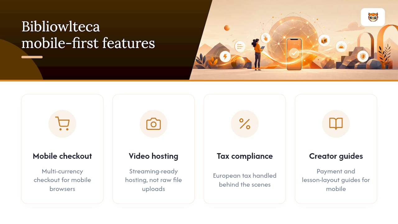
Bibliowlteca is built around the same checklist outlined above, because a course that doesn't work on a phone doesn't sell on a phone either. The platform handles multi-currency checkout so international learners can pay comfortably from a mobile browser, offers streaming-ready hosting for video lessons rather than forcing raw file uploads, and includes European tax compliance handled behind the scenes.
If you're setting up your storefront and payment flow, the guide on payment setup for course creators walks through mobile checkout configuration step by step. For structuring lesson pages so they read well on small screens, the practical frameworks for digital learning guide covers layout, image handling and font sizing in more depth than a single checklist can.
— BibliOWLteca
Ready to publish a mobile-tested lesson?
Run the one-hour mobile audit from this guide on your next lesson before you publish it. Open it on a real phone, check the touch targets, watch the video buffer (or not) on a throttled connection, and fix what breaks before learners ever see it.
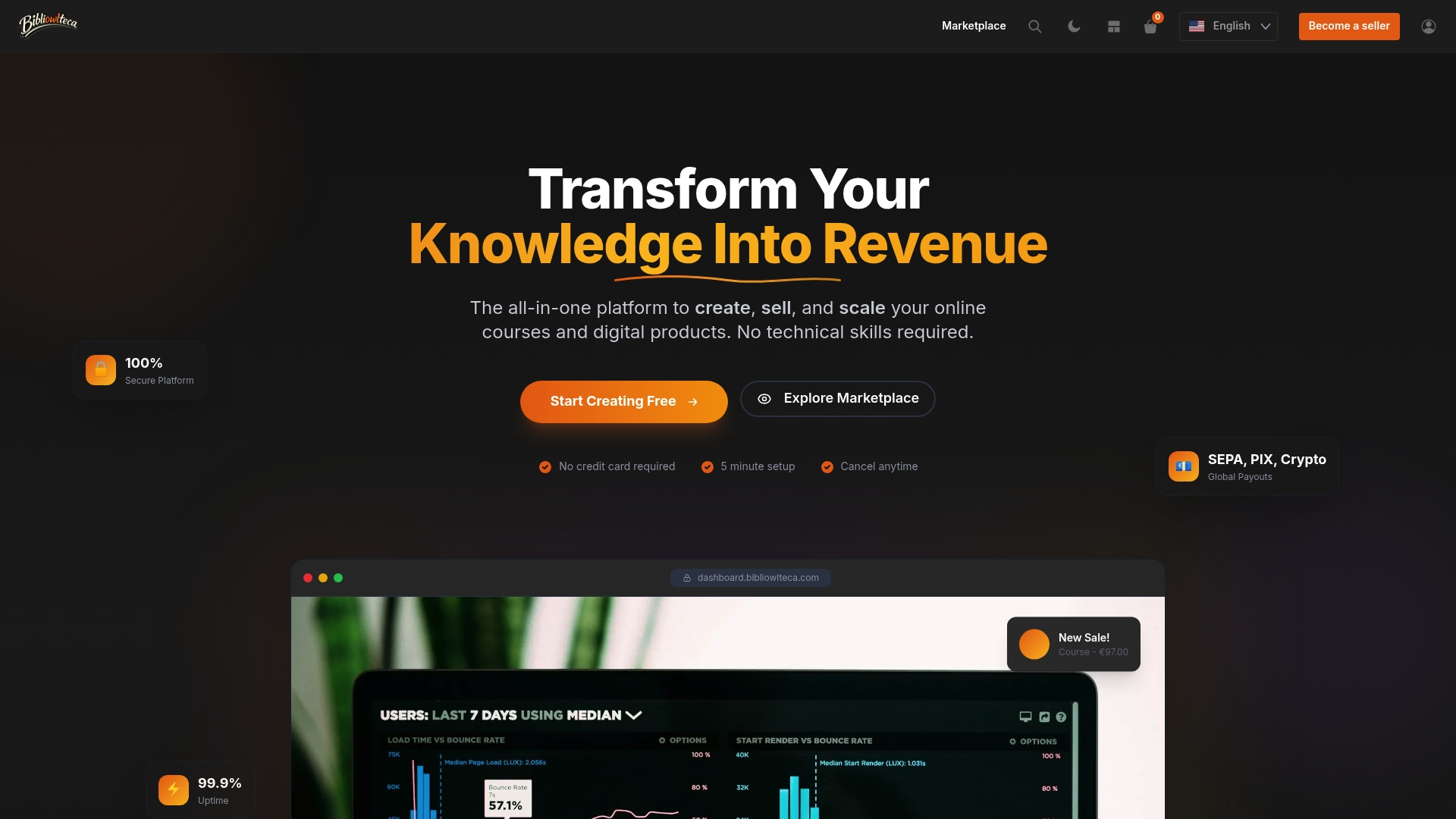
Bibliowlteca charges no monthly fee to list your course, only a transaction fee from £0.99 per completed sale, so a mobile-friendly lesson you publish today costs nothing to test and refine. Browse the course and template categories to see how other creators structure their storefronts for mobile buyers, and if you're weighing course platforms generally, GreenLearn's course listings show one example of how mobile-friendly course pages get presented to learners. When you're ready, set up your Creator Plan and publish your first test lesson this week.
Sources
- Designing Online Courses for Mobile Learners (Boise State / OSCQR analysis)
- Design for mobile (edX partner course staff guidance)
- Mobile-first learning video (Forasoft)
FAQ
What is a mobiilisõbralik kursus?
It's a course built mobile-first: short lessons, touch-friendly interactions, adaptive video streaming, and a storefront that loads and checks out cleanly on a phone or tablet.
Which video format works best for mobile courses?
MP4 encoded with H.264 compression, served through adaptive streaming like HLS or DASH, so playback quality adjusts automatically to the learner's connection speed.
How small should tap targets be on a mobile course?
WCAG guidance recommends a minimum touch target of around 24 pixels, large enough for an average thumb to hit accurately without missing or double-tapping the wrong button.
Do I need to test my course on both iOS and Android?
Yes. Behaviour differs enough between the two, particularly around video playback and quiz rendering, that testing only one platform leaves real bugs undiscovered on the other.
Does Bibliowlteca charge to list a mobile-friendly course?
Bibliowlteca has no published monthly fee for creators; it charges a transaction fee starting from £0.99 per sale, with current pricing details available on its pricing page.