
Your sales page must do one thing: convince a stranger that their life looks different after buying your course or e-book, then make it trivially easy to pay. Before you write a single word of copy, finalise your offer — the price, the guarantee, and the core deliverables. Copy cannot rescue a vague offer; it can only articulate a strong one.
The non-negotiables, in order: an outcome-led headline, short proof beneath the hero, benefits framed as transformation (not a module list), a repeated CTA, a clear price with a risk reversal, and a FAQ that handles the two or three objections that actually stop people buying.
Table of Contents
- How to build your sales page fast: the TL;DR checklist
- What goes in each block of your sales page?
- Copy rules that actually convert
- Visual and UX rules that keep readers moving
- UK technical and legal checks before you publish
- What to measure and which A/B tests to run first
- Pre-launch checklist and common mistakes to fix
- Key takeaways
- The thing most creators get backwards
- Publish your sales page on Bibliowlteca
- Useful sources and official UK references
How to build your sales page fast: the TL;DR checklist
Work through this before you open any page builder.
Hero block
- Headline states the buyer's after-state, not your credentials.
- One-line subhead names who it is for and how long it takes.
- Primary CTA button sits above the fold, action-oriented ("Start the course today").
Proof and offer
- Logo row or two short testimonials directly beneath the hero.
- Offer section: what is included, up to three price tiers, guarantee or refund window stated plainly.
Delivery and checkout
- PCI-compliant payment gateway, tested on mobile.
- Instant access confirmed by email; course or file link works immediately.
Launch checks
- VAT settings configured at platform level.
- GDPR consent checkbox on the checkout form.
- Accessibility: sufficient colour contrast, alt text on images.
- Run a real test purchase before going live.
Pro Tip: Write your guarantee before your headline. If you cannot state a clear refund policy in one sentence, your offer needs more work before the copy does.
What goes in each block of your sales page?
A high-converting page structure follows a reliable sequence: hero, problem, demonstration, benefits, proof, offer, risk reversal, FAQ, final CTA. Here is what to put in each.
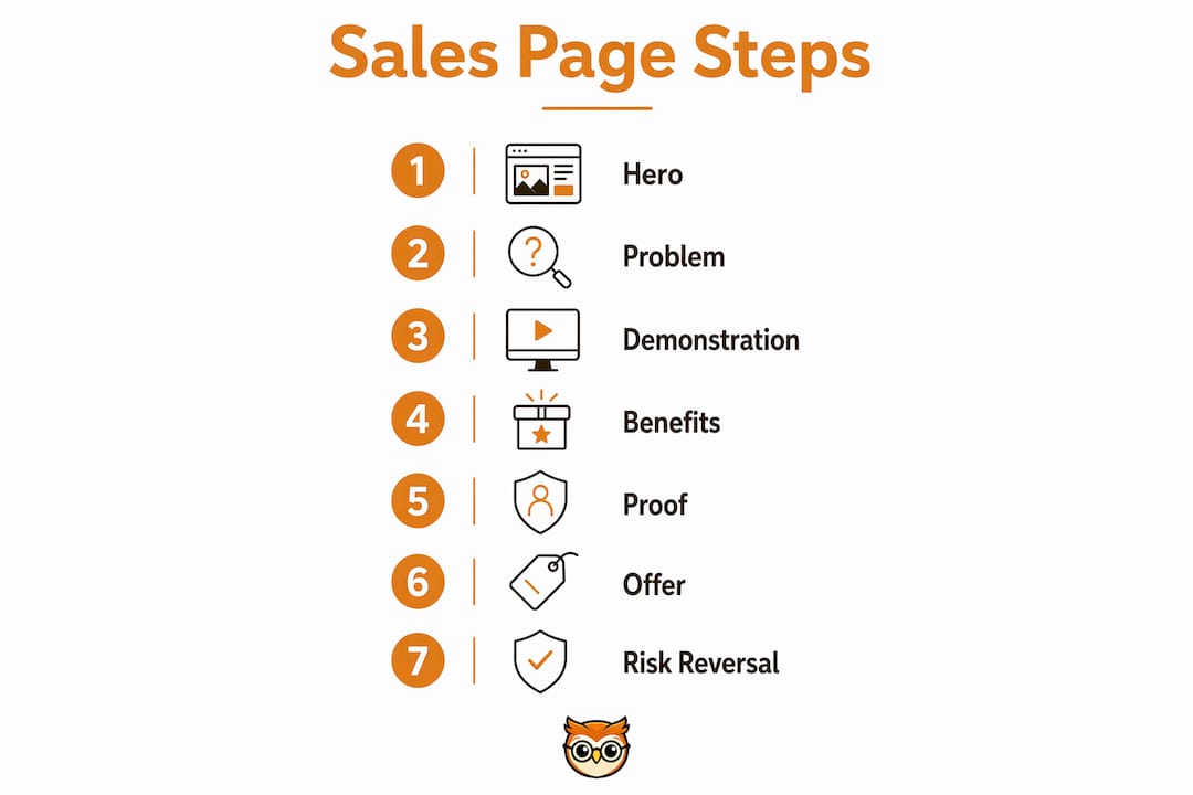
Hero
Copy prompt: "By [timeframe], you will [specific outcome] — even if [common objection]." Example headline: "Speak confident business Spanish in 90 days — no classroom required."
Problem and demonstration
Name the frustration in the reader's own words, then show the mechanism that solves it. A short screen recording or a single annotated screenshot works better than a feature carousel.
Benefits and features
Lead with transformation, follow with proof. "You will close your first freelance client" is a benefit. "Six recorded modules" is a feature. Outcome-first copy consistently outperforms spec-sheet writing.

Proof
Thread testimonials throughout the page, starting directly beneath the hero. A logo row plus one case study with a measurable result (time saved, income gained) builds belief faster than a wall of five-star ratings at the bottom.
Offer, pricing, and risk reversal
State the price clearly. Three tiers maximum. Include a 14- or 30-day refund window and say so explicitly — it reduces purchase anxiety more than any discount.
FAQ and final CTA
Answer the three objections that actually stop people buying. Close with the same CTA wording used in the hero so the page feels coherent, not pushy.
Short vs long form — when to use each:
| Page type | Best for | Typical length |
|---|---|---|
| Short-form | Low-price offers (under £50), warm audiences, simple products | 600 words |
| Long-form | Courses over £150, cold traffic, complex transformation | 3,000 words |
Long-form pages should usually run to around 3,000 words, while short-form pages for simpler or lower-value offers generally need 600 words.
Long copy earns its length when it builds belief and answers objections — not when it repeats the same point in different fonts.
Pro Tip: If your course costs more than £150, assume the reader needs convincing. Write long, then cut anything that does not move them closer to clicking "buy."
Copy rules that actually convert
The single biggest mistake is selling features instead of the after-state. A module list tells the buyer what they are getting. An outcome headline tells them who they become.
Four rules that move the needle:
- Mine your customers' language. Use the exact words your buyers use in reviews, DMs, and forum posts. Specific timeframes ("in three weekends") and concrete outcomes ("landed my first £2,000 client") convert better than polished marketing prose.
- Choose a framework and stick to it. PAS (Problem, Agitation, Solution) works well for cold traffic. AIDPPC (Attention, Interest, Description, Persuasion, Proof, Close) suits longer direct-response pages. The MECLABS heuristic is useful for auditing an existing page: value minus cost minus anxiety equals conversion probability.
- Match copy length to price and traffic temperature. A £29 e-book sold to your existing newsletter list needs 600 words. A £497 course sold via cold ads needs 3,000 words.
- Repeat the CTA without apology. Multiple prominent CTAs reduce friction; they do not feel pushy when each one follows a new piece of proof or a resolved objection.
CTA placement to test first: above the fold, after the proof section, and immediately after the pricing table. Wording variants worth testing: "Start today" vs "Get instant access" vs "Join [course name]."
Visual and UX rules that keep readers moving
Design is a visual conversation — every layout choice either moves the reader toward the CTA or distracts them from it.
Remove the top navigation entirely on your sales page. Every link that leads away from the page is a potential exit. Keep the header to your logo and, optionally, a single CTA button.
For media, one short looped video (under 90 seconds) showing the course interface or a key outcome outperforms a static image gallery. If video is not ready, a single annotated screenshot of the course dashboard or e-book preview is enough. Avoid feature carousels — they scatter attention.
On mobile, use a single-column layout, tap targets of at least 44×44px, and a persistent CTA button that stays visible as the reader scrolls. Simplify forms to the minimum fields needed: name, email, and payment details only.
For accessibility, meet WCAG 2.1 AA as a baseline: a contrast ratio of at least 4.5:1 for body text, descriptive alt text on every image, and a logical keyboard focus order. These are not optional niceties — the Equality Act 2010 applies to UK websites, and accessible pages also tend to load faster and convert better on low-end devices.
Pro Tip: A dark, restrained design with generous white space reads as premium. Resist the urge to add colour blocks, badges, and animations — each one competes with your CTA.
UK technical and legal checks before you publish
Handle these before the page goes live, not after.
Payments and delivery
- Use a PCI DSS-compliant gateway (Stripe and PayPal both qualify for UK sellers).
- Confirm that course access or file download is delivered instantly on payment confirmation.
- Test the full checkout on both desktop and mobile, including the confirmation email.
VAT on UK digital sales
- If your turnover exceeds the VAT registration threshold (currently £90,000), you must register and charge VAT on digital products sold to UK consumers.
- Display VAT-inclusive pricing on the sales page and checkout.
- Configure VAT settings at platform level so invoices are generated correctly.
GDPR and data handling
- Include a consent checkbox for marketing emails — pre-ticked boxes are not compliant.
- Link to your privacy notice from both the sales page and the checkout.
- Collect only the data you need; store it securely.
Terms and refund policy
- State your refund window explicitly on the sales page (not just in buried terms). The Consumer Contracts Regulations 2013 give UK buyers a 14-day cooling-off right for digital products unless access is granted before that period ends and the buyer consents to waive it in writing at checkout.
For a practical guide to building a compliant digital store, the technical architecture matters as much as the copy.
What to measure and which A/B tests to run first
Set up GA4 event tracking and cross-reference with server-side payment receipts before you drive any traffic. These two sources together give you a reliable conversion rate.
| Metric | What good looks like | Notes |
|---|---|---|
| Page-to-checkout CTR | 15–30% | Low CTR points to a weak hero or CTA |
| Checkout conversion rate | 50% | Drop-offs here suggest friction or price anxiety |
| Overall page conversion | 1–5% (cold traffic) | Warm audiences typically 3–10% |
| Revenue per visitor (RPV) | Varies by price point | The single most useful combined metric |
| Refund rate | Under 5% | High refund rate signals mismatched expectations |
Run one test at a time. Start with the headline and subhead — they affect every visitor. Then test CTA wording, then proof placement (testimonial above vs below the fold). Run each test until you have at least 200 conversions per variant before drawing conclusions; smaller samples produce unreliable results.
Pre-launch checklist and common mistakes to fix
Before you publish, confirm:
- Offer finalised: price, guarantee, and deliverables locked.
- Outcome headline written and tested with at least one real person outside your network.
- CTAs placed above the fold, after proof, and after pricing.
- Social proof embedded — at least one testimonial beneath the hero.
- Payment tested with a real transaction (refund yourself afterwards).
- VAT settings and GDPR consent text in place.
- Mobile layout checked on an actual phone, not just a browser emulator.
- Page speed tested — aim for under three seconds on a 4G connection.
Common mistakes and quick fixes:
- Feature-heavy copy: Replace module names with outcome sentences. Takes 30 minutes.
- Social proof buried at the bottom: Move one testimonial directly beneath the hero. Takes five minutes.
- Single CTA: Add a second CTA after the proof section. Takes ten minutes.
- Unclear pricing: Add a simple comparison table with three tiers. Takes 45 minutes.
- VAT not configured: Set this at platform level before any sale. Takes 20 minutes.
- Mobile CTA invisible: Make the button full-width and sticky on scroll. Takes 15 minutes.
Post-launch monitoring: Check traffic and conversion data at 24 hours and 48 hours. If checkout drop-off is above 50%, investigate the payment flow first. If page-to-checkout CTR is below 10%, the hero needs work. For scaling course sales beyond your first launch, the same metrics apply at higher volumes.
Key takeaways
A converting sales page requires a clear after-state headline, proof threaded from the hero downward, and a frictionless checkout — all built on a finalised offer with an explicit refund policy.
| Point | Details |
|---|---|
| Finalise the offer first | Lock price, guarantee, and deliverables before writing a single word of copy. |
| Lead with the after-state | Your headline must show what changes for the buyer, not what the course contains. |
| Thread proof from the hero | Place at least one testimonial or case study directly beneath the hero, not at the bottom. |
| Handle UK compliance early | Configure VAT, GDPR consent, and your refund policy before the page goes live. |
| Bibliowlteca handles the technical layer | The platform manages secure delivery, multi-currency payments, and VAT so you focus on copy and offer. |
The thing most creators get backwards
The most common pattern on creator sales pages is this: weeks spent on design, fonts, and colour palettes — then a headline written in ten minutes that says something like "Welcome to my course." The copy is an afterthought. The offer is vague. The guarantee is buried in the footer.
The pages that actually convert tend to look almost plain by comparison. What they have is specificity: a headline that names a real outcome in a real timeframe, a testimonial that mentions a concrete result, and a price that is easy to find. That is it.
One thing worth doing before anything else: move a single strong testimonial — one that mentions a specific, measurable result — from wherever it currently sits to directly beneath your hero. It takes five minutes and it is consistently the highest-impact structural change on a sales page. The rest of the page can be imperfect. That one placement change tends to lift belief faster than any copy rewrite.
For creators ready to go further, Bibliowlteca's digital publishing resources and case study library are worth bookmarking for the next iteration.
Publish your sales page on Bibliowlteca
Bibliowlteca removes the technical friction that stalls most creators between "offer ready" and "first sale made." The platform handles secure digital delivery, multi-currency payments, and VAT compliance in one place — so you are not stitching together three separate tools before you can take a payment.
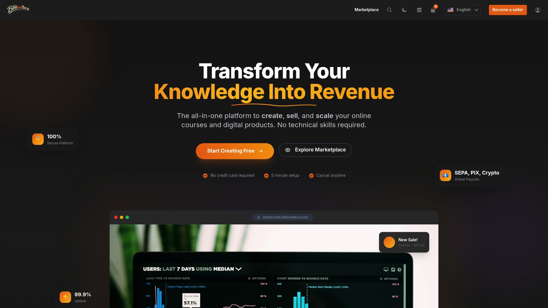
Where most platforms make you configure payment gateways, delivery rules, and tax settings separately, Bibliowlteca builds them into the same workflow. You publish your course or e-book, set your price, and the checkout, delivery, and invoicing work immediately. For UK creators selling internationally, multi-currency support means a buyer in Germany or Canada pays in their own currency without any extra setup on your end.
The practical next step: list your e-book or course on Bibliowlteca and have a live, compliant sales page ready to receive traffic today.
Useful sources and official UK references
- How to write copy that sells — Asset Academy: The clearest practical guide to outcome-first copywriting and offer finalisation. Start here.
- 7 principles of effective sales copy — CXL: Peep Laja's case for long-form copy on higher-value offers; grounded in conversion data.
- How to design a long-form sales page — CXL: Design and media guidance; particularly useful for mobile layout and typography decisions.
- Sales page structural patterns — Crucible: Teardowns of top-converting pages; use this to audit your block order and proof placement.
- Sales copy best practices — Crazy Egg: Practical CTA guidance and repetition strategy.
- The AIDPPC formula — CDMG: Concise explanation of the AIDPPC framework for direct-response pages.
- VAT registration — GOV.UK: Official UK threshold and registration rules for digital product sellers.
- Consumer Contracts Regulations 2013 — legislation.gov.uk: Governs the 14-day cooling-off right and digital product waiver rules for UK sellers.
- UK GDPR guidance — ICO: The Information Commissioner's Office guidance on consent, data minimisation, and privacy notices.
- WCAG 2.1 guidelines — W3C: The accessibility standard referenced by the Equality Act 2010; use the AA level as your baseline.
- Naomi Lennon — creator economy operator: Independent practitioner advice on creator funnels and product launches; useful for launch sequencing and audience warm-up strategy.